Case study · Community resource platform · Minnesota

Thrive Together

A community resource guide for Cook County, Minnesota: discovery, cultural and visual research, logo design, a brand palette and two homepage directions for one place where residents find local health, wellbeing and social services.

The place and the people

Cook County sits at the northeastern tip of Minnesota, between Lake Superior and the Canadian border. It is home to the Grand Portage Band of Lake Superior Chippewa, and Ojibwe culture, one of the oldest cultures of this land, still meets the other cultures of the North Shore in everyday life.

Cook County Public Health needed one place where residents could find local resources. In the discovery survey, staff and partners asked for exactly that: “one access point for community resources that we can all collectively direct people to.” They wanted visitors to feel welcomed, supported and confident, and they asked for the site to speak in English and Ojibwe.

For me, the most beautiful part of the project was building a creative concept from that culture. Before drawing anything, I studied the Ojibwe language and its visual traditions to understand which visual resources could help the community recognize itself in the site.
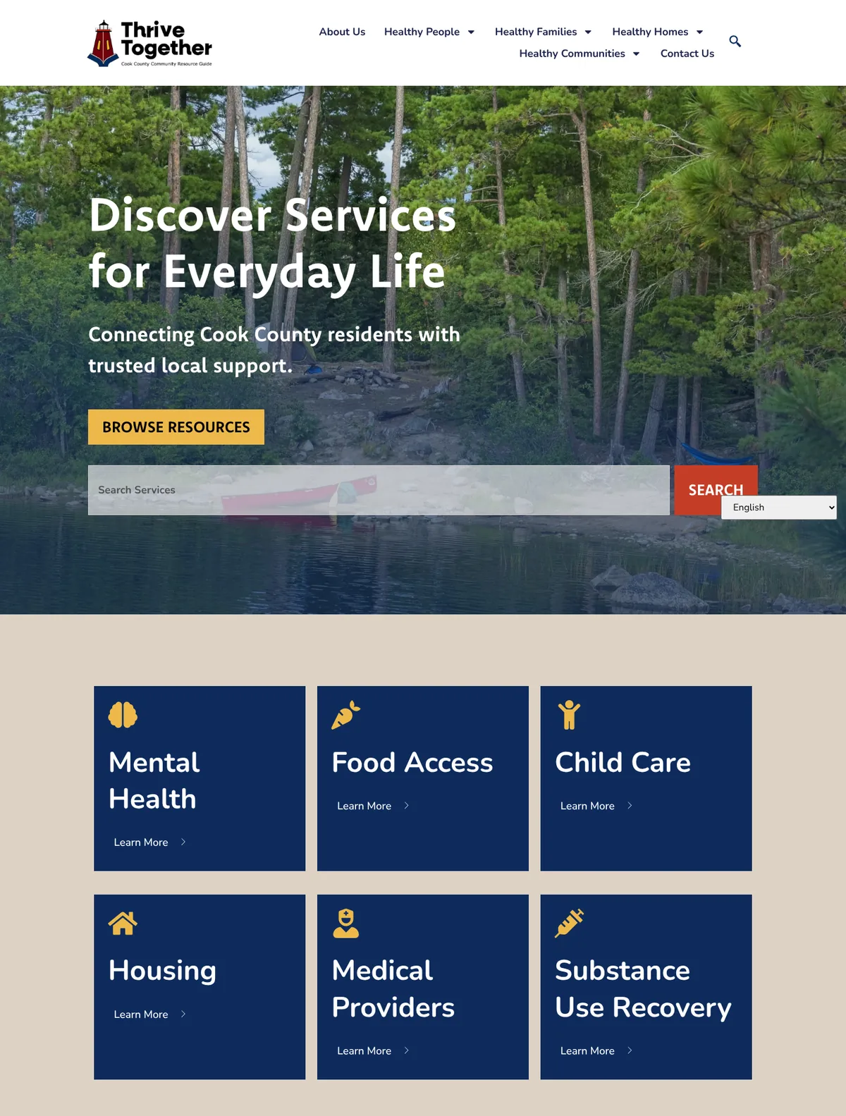
The live Thrive Together homepage: a canoe on a lake among pine trees behind the headline Discover Services for Everyday Life, a search bar, and blue cards for mental health, food access, child care, housing, medical providers and substance use recovery.
The live site. Photography by Paul Sundberg and David Johnson.

What we designed as a team

The identity came first. We proposed three logo concepts:

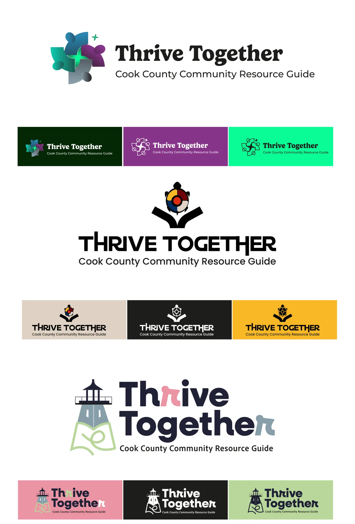
  • Northern Light Harmony. The aurora borealis drawn as simple human figures that form a wind rose: unity, direction and the open landscape of the north.
  • Wisdom of the Directions. Ojibwe health symbols in one mark: the medicine wheel and its four directions, the turtle (Mikinaak) as Mother Earth, and an open book for shared health knowledge.
  • Thrive Fusion. The lighthouse, a landmark of Cook County, as a symbol of guidance and safety.

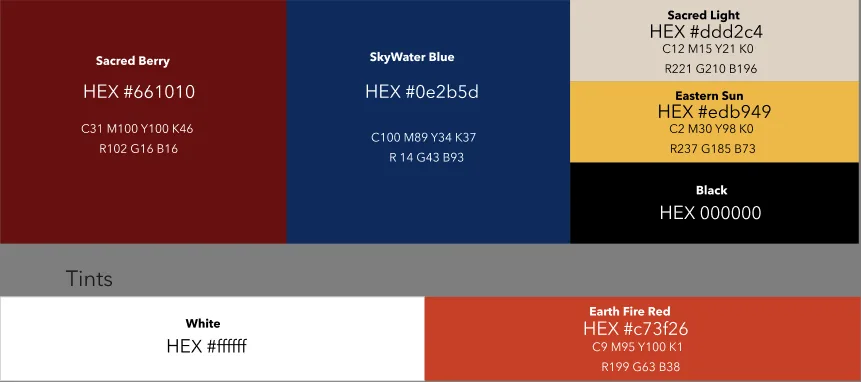
The final logo keeps the lighthouse as the main symbol, sets it on the open book and takes its palette from the medicine wheel concept: SkyWater Blue, Sacred Berry, Eastern Sun, Earth Fire Red and Sacred Light.

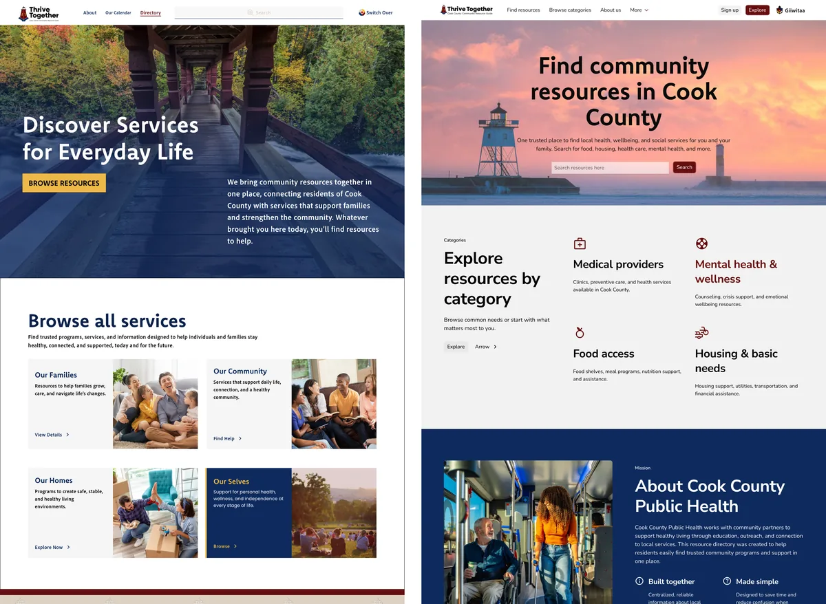
Then two homepage directions. The first opens with a local photograph and organizes services by areas of life: families, community, homes and ourselves. The second leads with search and the needs staff named most: medical providers, food access and mental health.

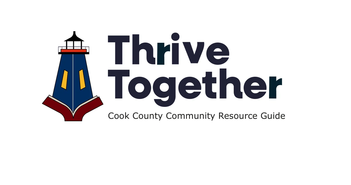
Final Thrive Together logo: a navy lighthouse with a yellow light standing on an open red book, next to the name Thrive Together and the line Cook County Community Resource Guide.
The final logo: the lighthouse as a guide, standing on an open book.
Thrive Together brand palette: Sacred Berry #661010, SkyWater Blue #0E2B5D, Sacred Light #DDD2C4, Eastern Sun #EDB949, Black, White and Earth Fire Red #C73F26.
Brand palette drawn from the colors of the medicine wheel.
Three logo concepts for Thrive Together, each with color variations: a geometric aurora mark in teal and purple; a medicine wheel above a turtle and an open book; and a lighthouse on an open book in soft pink and green.
Three logo concepts: Northern Light Harmony, Wisdom of the Directions and Thrive Fusion.
Two homepage directions side by side. Left: a wooden footbridge in the forest behind the headline Discover Services for Everyday Life, with service cards for families, community, homes and ourselves. Right: a lighthouse at sunset behind the headline Find community resources in Cook County, a search bar and categories for medical providers, mental health, food access and housing.
Two homepage directions: areas of life first, or search and urgent needs first.

Real places, real photographs

The photographs on Thrive Together are the work of local photographers Paul Sundberg and David Johnson: the forests, the lake and the shoreline that residents know.

When so many images online are stock or generated, a real photograph of a real place tells people, before any text does, that the site is about them and that its information can be trusted.

“Real photography gives a website a credibility you cannot measure, especially today.”

Built for return visits

A resource guide works when people come back to it, not only in a moment of crisis. The structure follows how residents think about their lives, the model staff admired in Pine County Connect: healthy people, healthy families, healthy homes and healthy communities.

Search sits in the hero. Quick cards answer urgent needs in plain words, like “I need food now”. Events, youth programs and a newsletter give people reasons to return between needs.

Accessibility decisions

  • White text only on the dark brand colors: SkyWater Blue (13.8:1) and Sacred Berry (12.8:1).
  • Eastern Sun, the yellow, always with dark text: 7.6:1 with SkyWater Blue. White on that yellow would be 1.8:1.
  • Earth Fire Red for buttons with white text (5:1), never for small text on Sacred Light (3.4:1).
  • Search before browsing, and category names in plain language.
  • A language option in the header for English and Ojibwe, as staff asked. The AndiSites team built the language support.

From proposal to live site

The live site kept the core of the proposal: the first direction’s hero, “Discover Services for Everyday Life”, with search right below it; category cards in SkyWater Blue with Eastern Sun icons; the lighthouse logo; and the Sacred Berry footer. The navigation grew into four areas, Healthy People, Healthy Families, Healthy Homes and Healthy Communities, and local photography carries the whole site. The AndiSites team built the site and its English and Ojibwe language support.

My role in the team

Part of the AndiSites Inc. team, through eMirDesigner LLC: discovery synthesis, cultural and visual research, logo design, brand palette and homepage design.