Case study · Justice nonprofit · Mississippi
Mississippi Center for Justice
A design proposal for the redesign of the Mississippi Center for Justice website: discovery, visual communication strategy, two creative concepts and two homepage directions.
Scope of this case study: the UX/UI design, my part in the team. The whole project, from proposal to launch, is in the full case study on AndiSites.
The design challenge
MCJ is a nonprofit law firm that offers free legal help in specific areas: housing, heirs’ property, expungement, education and health. In the discovery survey, the staff described the same problem: people did not know what MCJ does, so they called asking for services it does not provide, and those calls often ended in frustration on both sides.
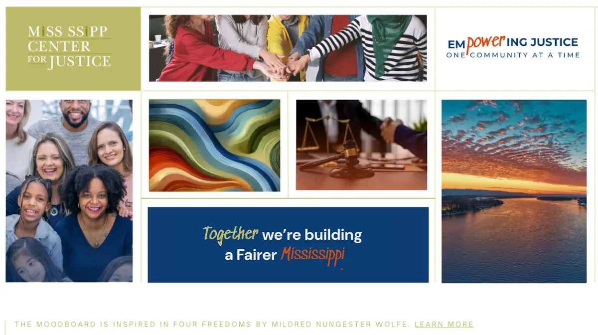
The people MCJ serves are mostly Mississippians facing economic, social and racial barriers. Close to 4 in 10 Mississippians are Black, the highest share of any state, and nearly 1 in 5 live in poverty (U.S. Census Bureau (opens in a new tab)). For them, a site that looks like their own communities, with their faces, their river and their art, says before any text does that this place is for them.
The site had to explain, clearly and calmly, what MCJ does and how to get help, and feel like a safe space where visitors see people who look like them.
What we designed as a team
With the team, we started from the staff survey and turned it into a visual communication strategy: clarity first, then warmth. From there we proposed two creative concepts:
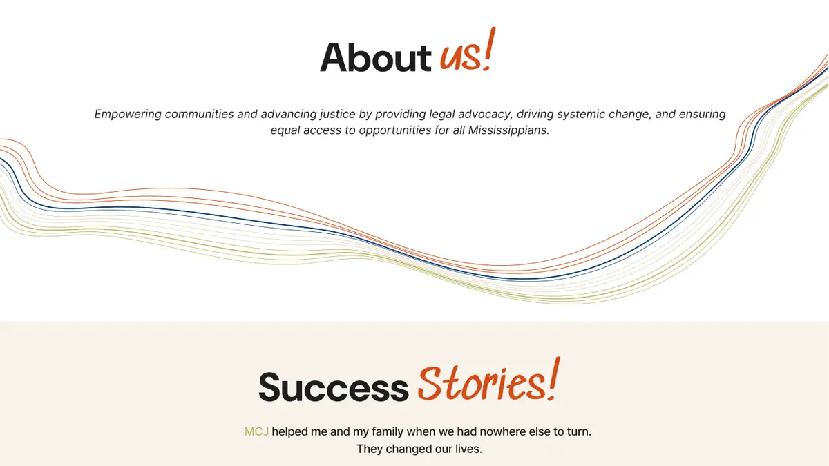
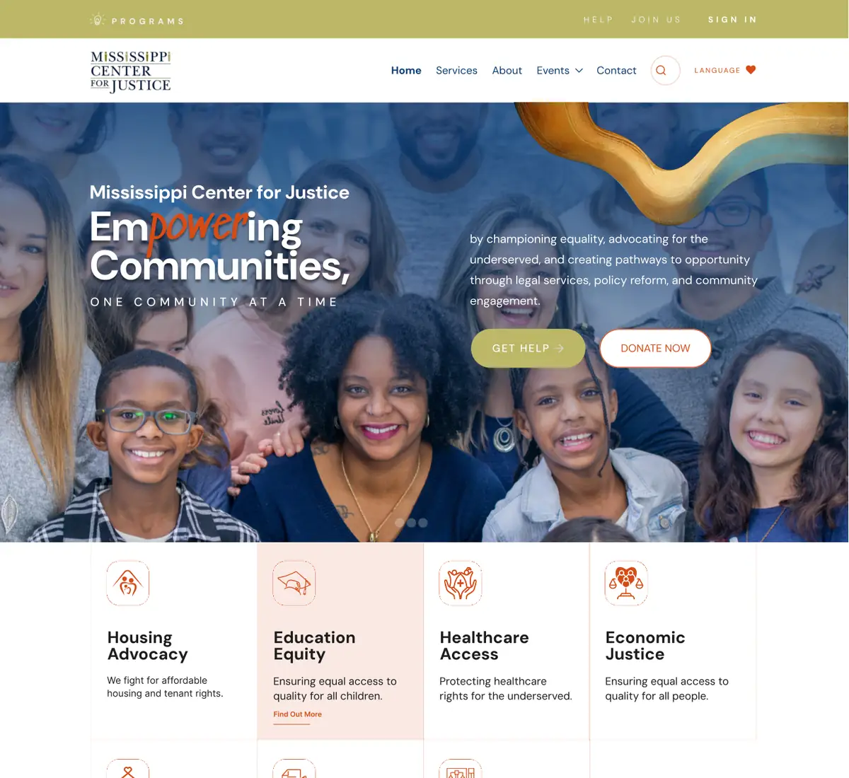
- Empowering Justice, One Community at a Time. Photography of real Mississippians; deep blue, olive, terracotta and sand; a bold sans-serif for headlines and handwritten accents for quotes and community stories.
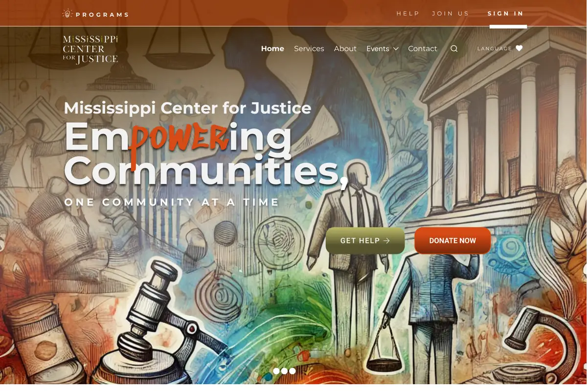
- Justice Through Art. A mural-like illustration that brings together Mississippi’s culture, its people and the symbols of justice, with brushstrokes and handwritten notes.
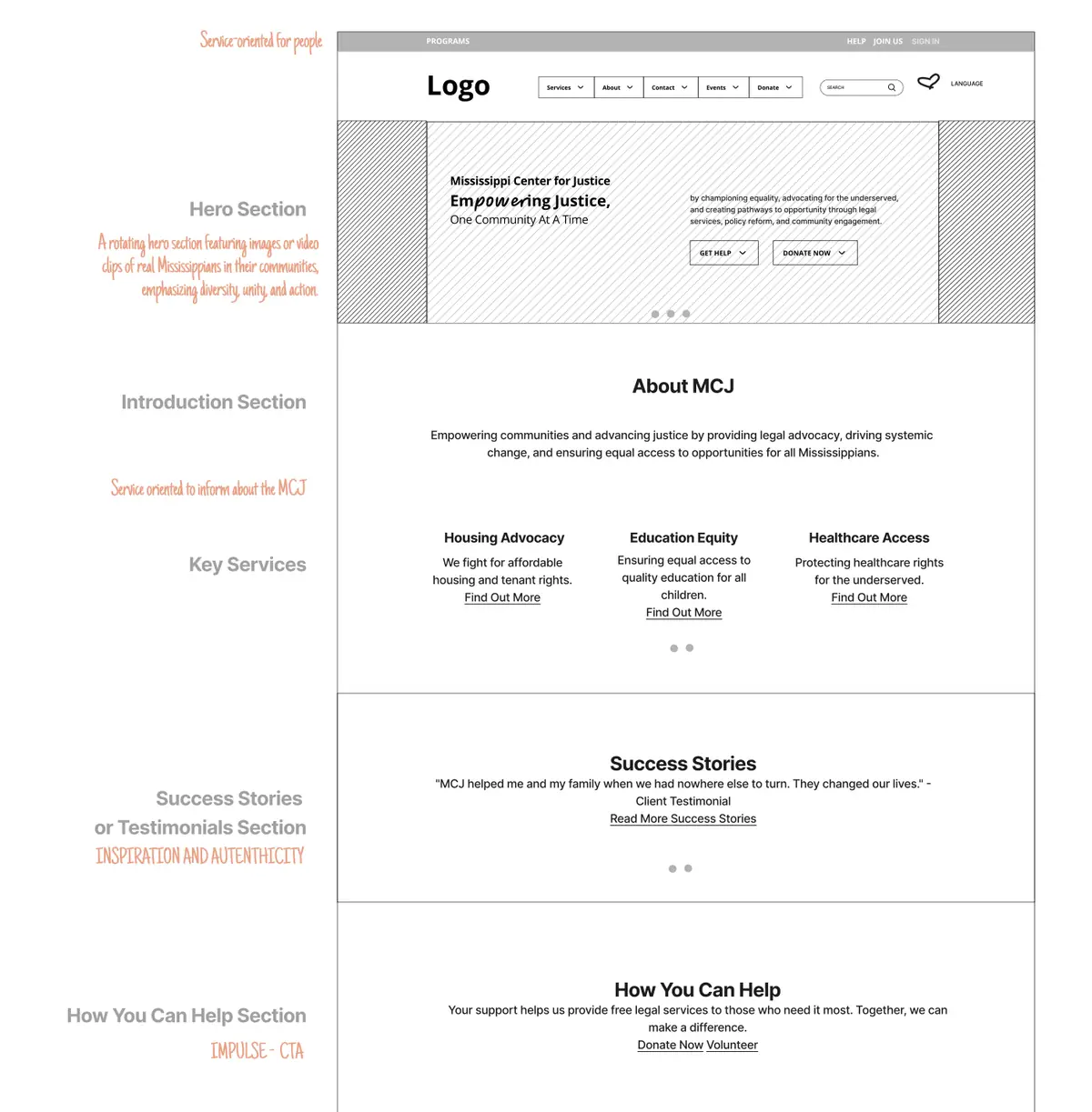
An annotated wireframe gave each homepage section one job: get help, understand MCJ, see its services, read real stories, support the mission and stay connected. Two homepage directions brought each concept to life.


Accessibility decisions
- Services right after the hero, so people see what MCJ does before they call.
- “Get Help” as the first action, ahead of “Donate”.
- Handwritten type only for short accents; all information in a clear sans-serif.
- A language option in the header.
From proposal to live site
A proposal is a starting point, not a template. As the project moved forward, the design adapted to what MCJ needed day to day: the hero now changes with each campaign, the olive gave way to deep blue, which also gives text more contrast, and the services gained a “Need something else?” card for people whose need is not on the list. What carried through is the concept: real people, warm color, handwritten accents and a clear path to help.
After launch, AndiSites reported (opens in a new tab) 96% more active users, 75% more engagement with legal resources and 47% more people interacting in depth with the content.
Recognition
MUSE Creative Award, Silver, 2026: Mississippi Center for Justice, MUSE Awards winners gallery (opens in a new tab). Awarded to AndiSites Inc. for the Mississippi Center for Justice website. My role: Digital & Graphic Designer.
My role in the team
Part of the AndiSites Inc. team, through eMirDesigner LLC: discovery synthesis, visual strategy, creative concepts, wireframe and homepage design.