Case study · County public health · Minnesota
Kanabec County Community Health
The visual design for Kanabec County Community Health: a calm, trustworthy identity and two homepage directions that put help first, for public health, family support and home care in Kanabec County, Minnesota.
The design challenge
Kanabec County Community Health serves a rural county in east-central Minnesota: public health, WIC, vaccines, home care, family support and more. Its information lived on three separate websites.
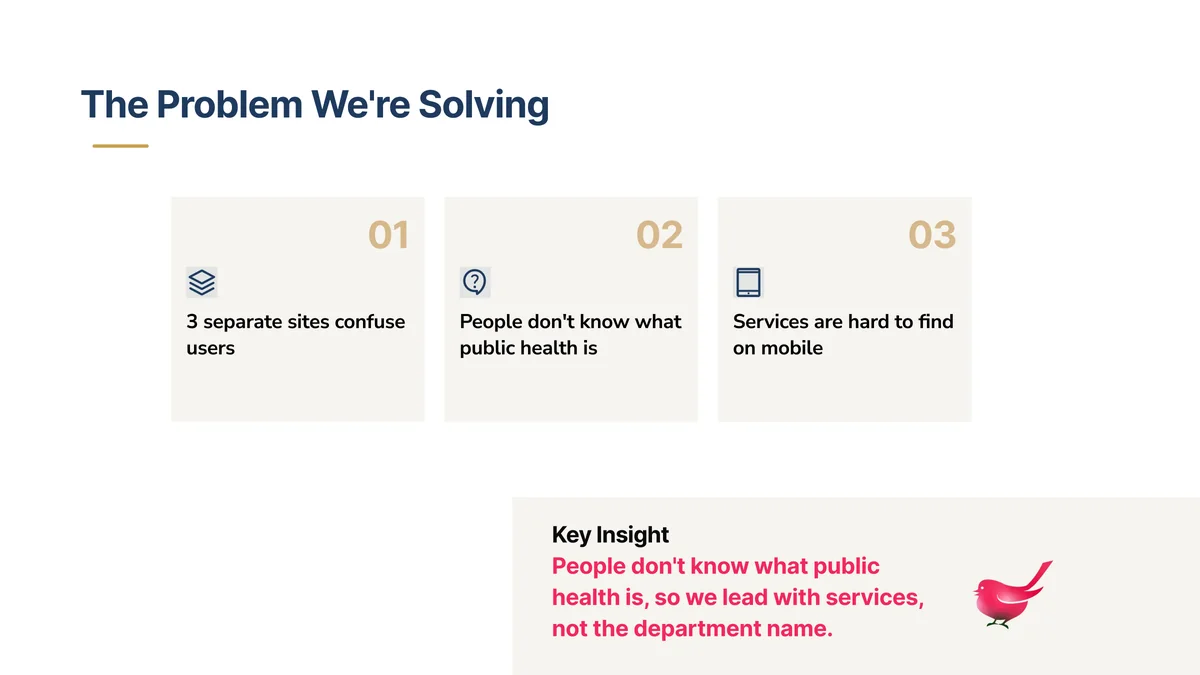
The discovery survey, run by the AndiSites team with eight staff members, named the problems: people do not know what public health is, services are hard to find on a phone, and the county site felt outdated and not welcoming. My part started there: turning those findings into a design that feels clear, warm and dependable.
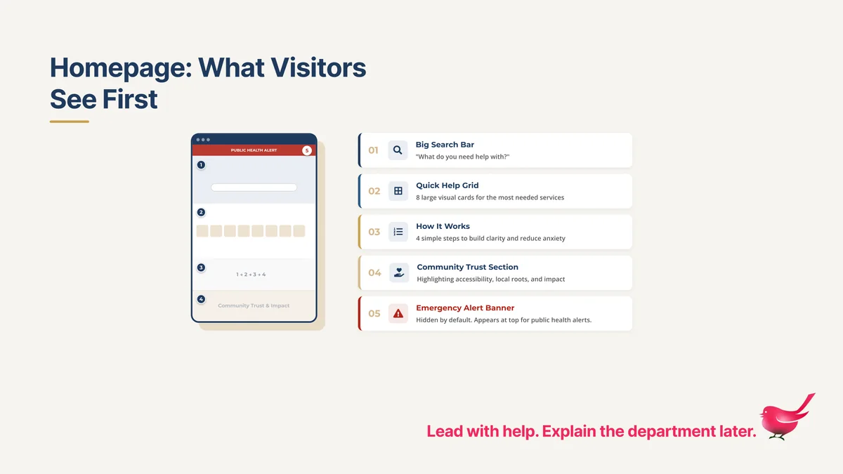
What we designed as a team
The design leads with help, not with the department name:
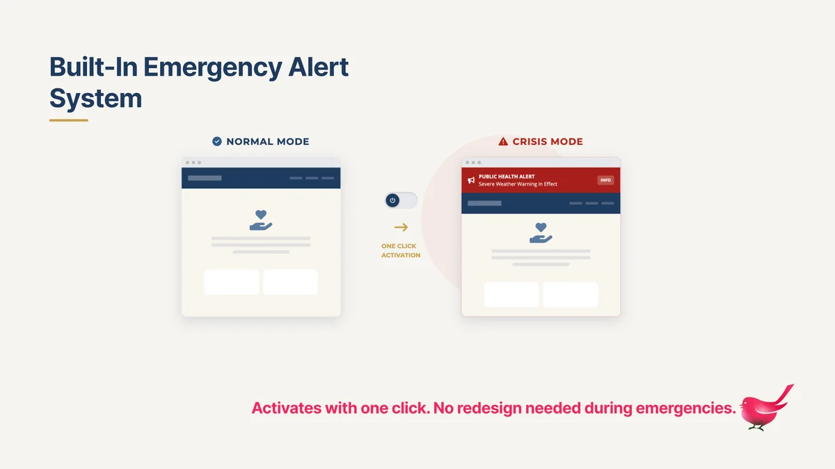
- A homepage in five parts. A large search bar that asks “What do you need help with?”, eight large service cards, four simple steps that explain how getting help works, a community trust section and an emergency alert banner that stays hidden until it is needed.
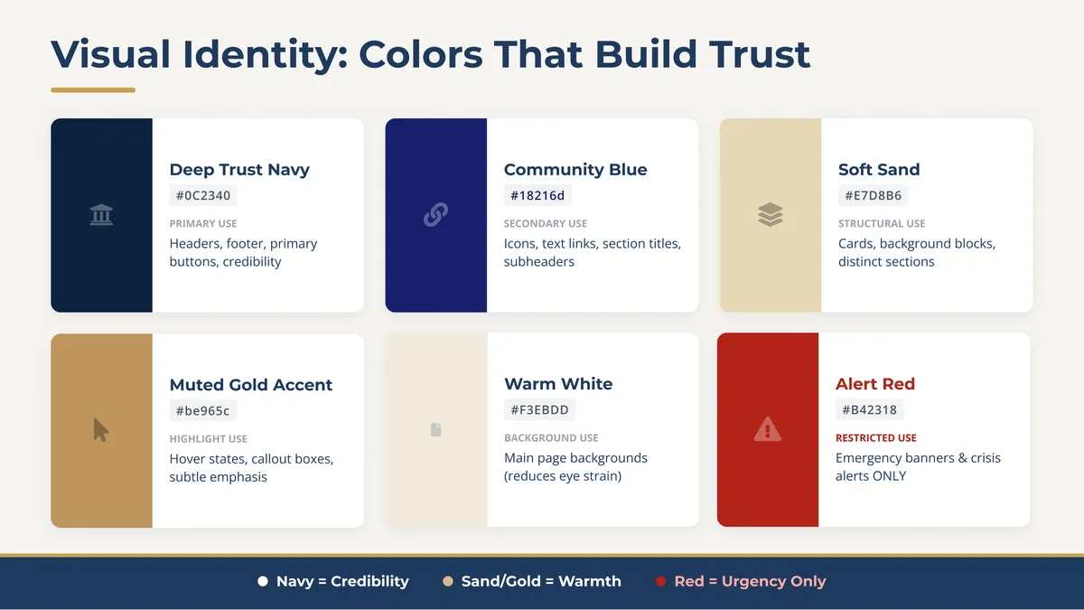
- A visual identity built on the staff’s values. Trust, willingness to help, accessibility and collaboration became navy for credibility, sand and gold for warmth, and red only for urgency.
- Typography. Headlines in Bookman Old Style, a classic serif that feels local and dependable, with a clean sans-serif for reading.
- Components. Service cards, numbered steps, impact figures and the alert banner, designed as one system so they look the same on every page.


Two directions, one principle
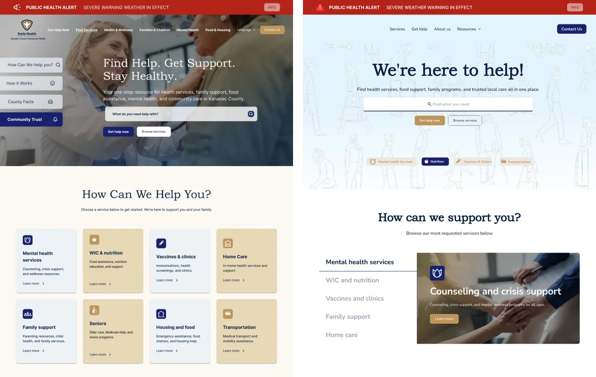
Both homepages follow the same rule: help first, institution second.
Direction 1, immediacy. Strong hierarchy, high contrast and modular service blocks take people to help before the department introduces itself. Bookman Old Style with Inter.
Direction 2, calm. A soft blue palette and a delicate line-art banner of people add warmth without competing for attention. Bookman Old Style with Nunito.

Trust for residents and commissioners
Staff described commissioners as hesitant, so the homepage includes a community trust section that makes the department’s work visible: families served, vaccines given and partners working together. The figures in the mockups are approximate.
For emergencies, the alert banner and preloaded “dark pages” can be switched on in one click, with no redesign.
Accessibility decisions
- Navy carries the text: white on Deep Trust Navy is 15.8:1, and navy on Soft Sand is 11.2:1.
- Alert Red only for emergencies, with white text at 6.6:1, so red always means urgent.
- Muted Gold as a surface or accent with navy text (5.8:1). As text color, or under white text, it falls below 3:1, so it never carries words on its own.
- Search first, large cards that are easy to tap, plain-language labels and four steps that tell people what to expect.
- Designed for phones from the start, because that is where residents were getting lost.

From design to build
The site is now in development with the AndiSites team, and I am part of the build: one content system to replace the three websites, a directory of services and the emergency toolkit. A design proposal is a starting point, not a template; as the build moves forward, the design keeps adapting to what the department needs day to day.
My role in the team
Part of the AndiSites Inc. team, through eMirDesigner LLC: visual identity, homepage design, two homepage directions, design components and the WordPress build.