Case study · Public technical college · Minnesota
Hennepin Technical College
A website redesign for a technical college with two campuses and many audiences: future and current students, staff, visitors and employers. Three homepage directions and a system of internal page templates, designed from what the data said about how people use the site.
Scope of this case study: the UX/UI design, my part in the team. The whole project, from proposal to launch, is in the full case study on AndiSites.
What the data said
The discovery included a review of a full year of Google Analytics. Four findings shaped the design.
Half the visits come from a phone.
What it meant for the design
The design had to work as well on a phone as on a desktop, with the same order and the same next step.
Most visitors are 18 to 34.
What it meant for the design
Real students and real labs, direct language and the next step always in view.
Many people leave the homepage and eServices before applying.
What it meant for the design
Clear paths from the homepage to Programs, Apply and eServices, and a way back to the application from every page.
Many visitors land deep, from search, on program pages.
What it meant for the design
Consistent internal templates with breadcrumbs, so any page says where you are and what to do next.
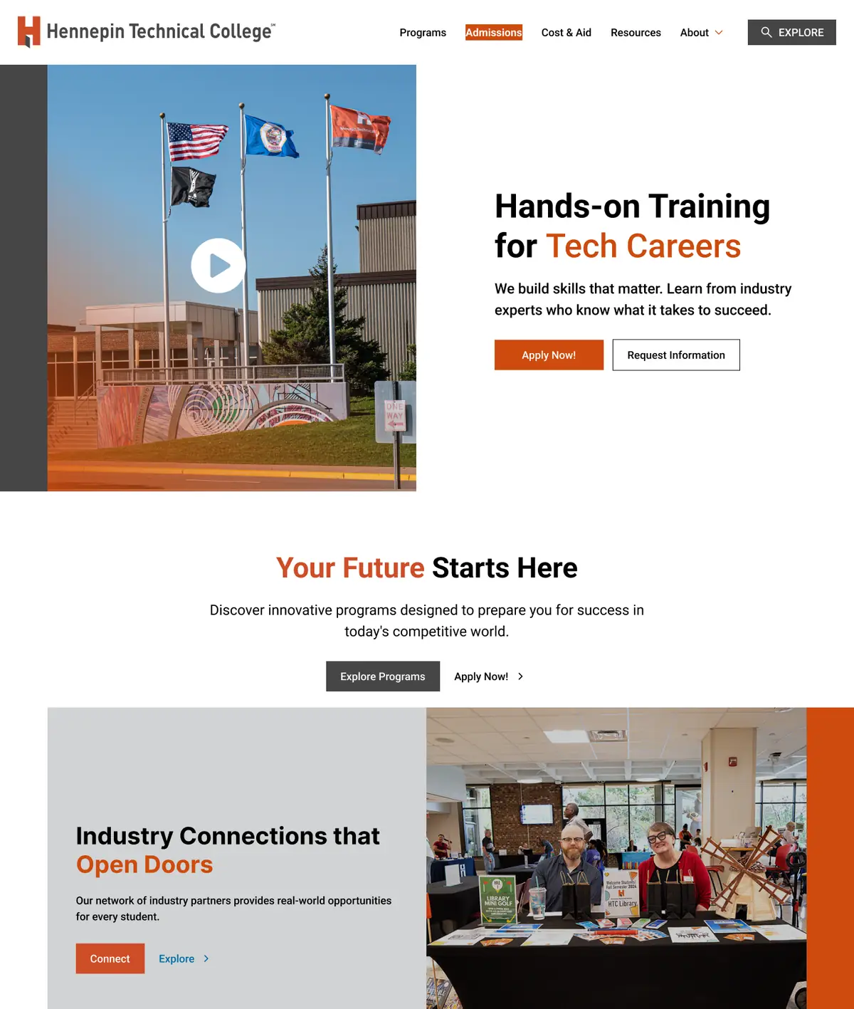
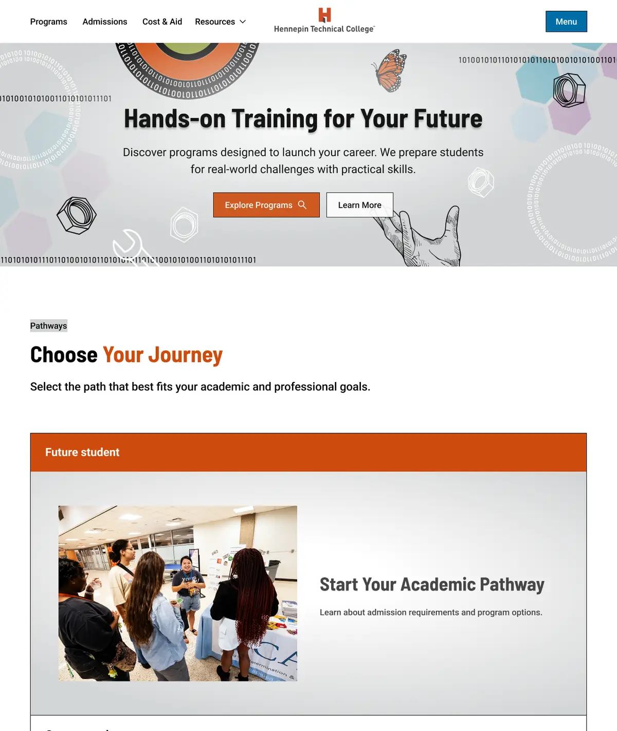
Three homepage directions
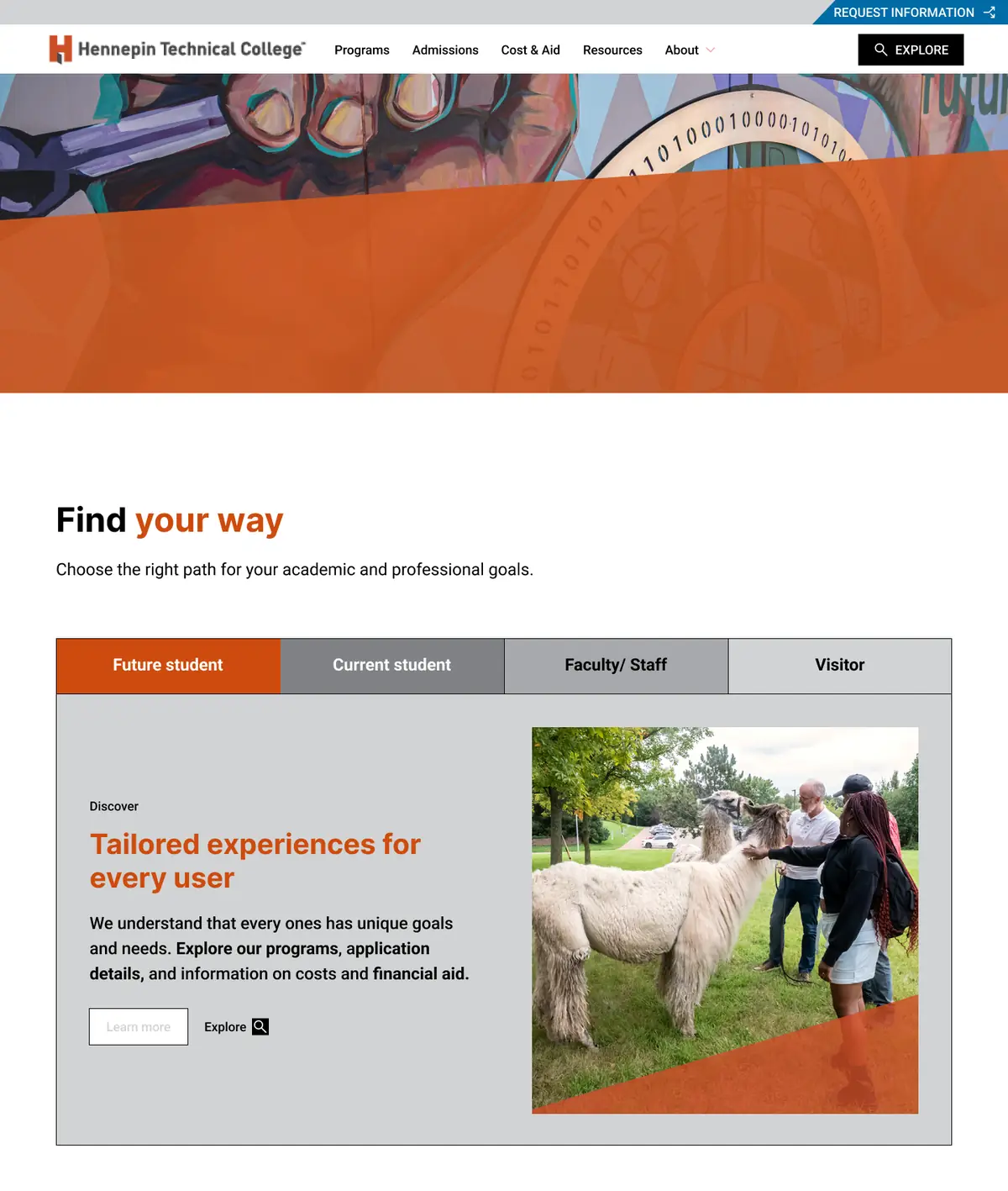
Each direction answers the same question in a different way: how do future students, current students, staff and visitors each find their path in one step?


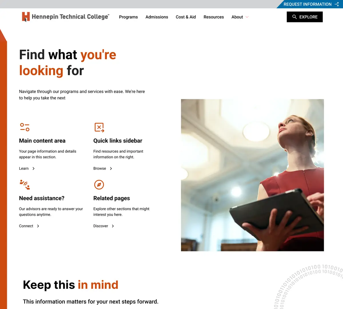
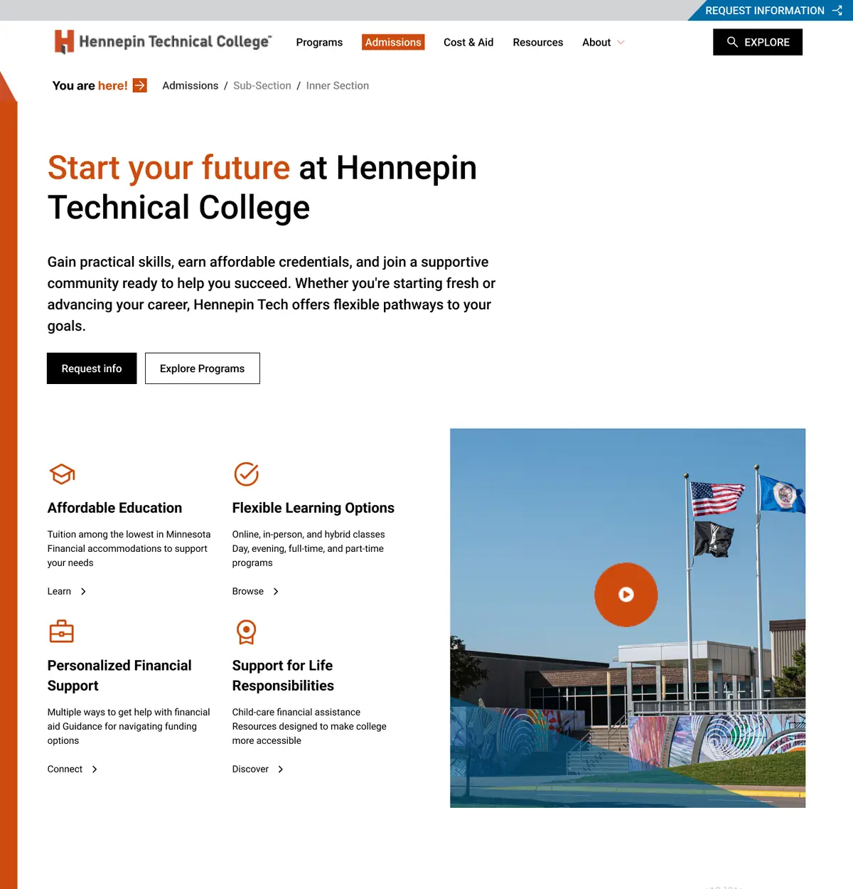
A system of internal pages
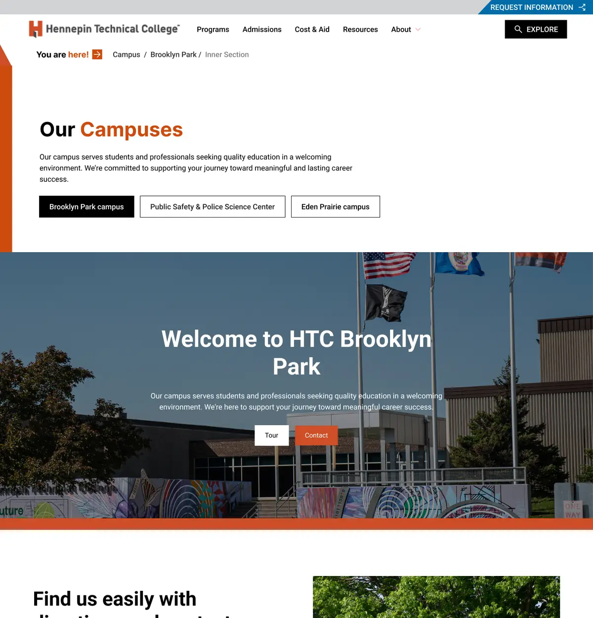
Templates that share the same rules: a clear heading, breadcrumbs, the next step and help nearby. A program page, an admissions page and a campus page read the same way, wherever people land.


Accessibility decisions
- One step to each audience’s path: future student, current student, staff and visitor.
- Request Information and Apply within reach on every template.
- Breadcrumbs on internal pages, for people who arrive from search.
- The same structure across program and service pages, so nothing has to be relearned.
From proposal to live site
A proposal is a starting point, not a template. The live site carries direction A: the college’s own mural, the orange band, role-based paths and a clear route to Request Info and Get Started, adapted with the college along the way. Within three months of launch, applications rose 12% and audience reach 15%, as reported in the AndiSites case study.
Recognition
w3 Award, Silver, 2026: Hennepin Technical College, w3 Awards winners gallery (opens in a new tab). Awarded to AndiSites Inc. for the Hennepin Technical College website. My role: Digital & Graphic Designer.
My role in the team
Part of the AndiSites Inc. team, through eMirDesigner LLC: homepage directions, internal page templates and visual design.