Case study · Community college · North Carolina
Fayetteville Technical Community College
The visual design for a community college with more than 300 programs: a black-and-gold interface with real students at the center and a palette built to stay readable.
Scope of this case study: the UX/UI design, my part in the team. The whole project, from proposal to launch, is in the full case study on AndiSites.
The design challenge
FTCC serves recent high school graduates, working adults, veterans and military families. Its website looked dated: a color scheme without energy and stock photos that showed neither its students nor Fayetteville.
The visual design had to feel proud, current and clear for every one of those students, on any screen, and still be unmistakably FTCC.
What we designed as a team
We kept FTCC’s identity and gave it a more confident, current voice:
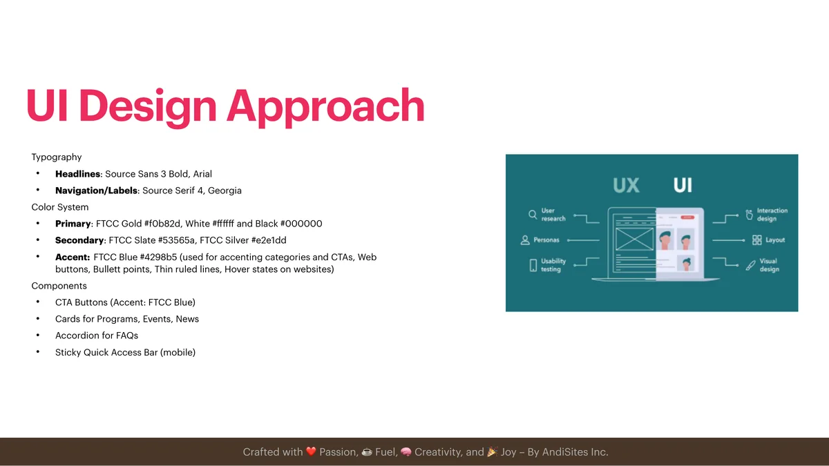
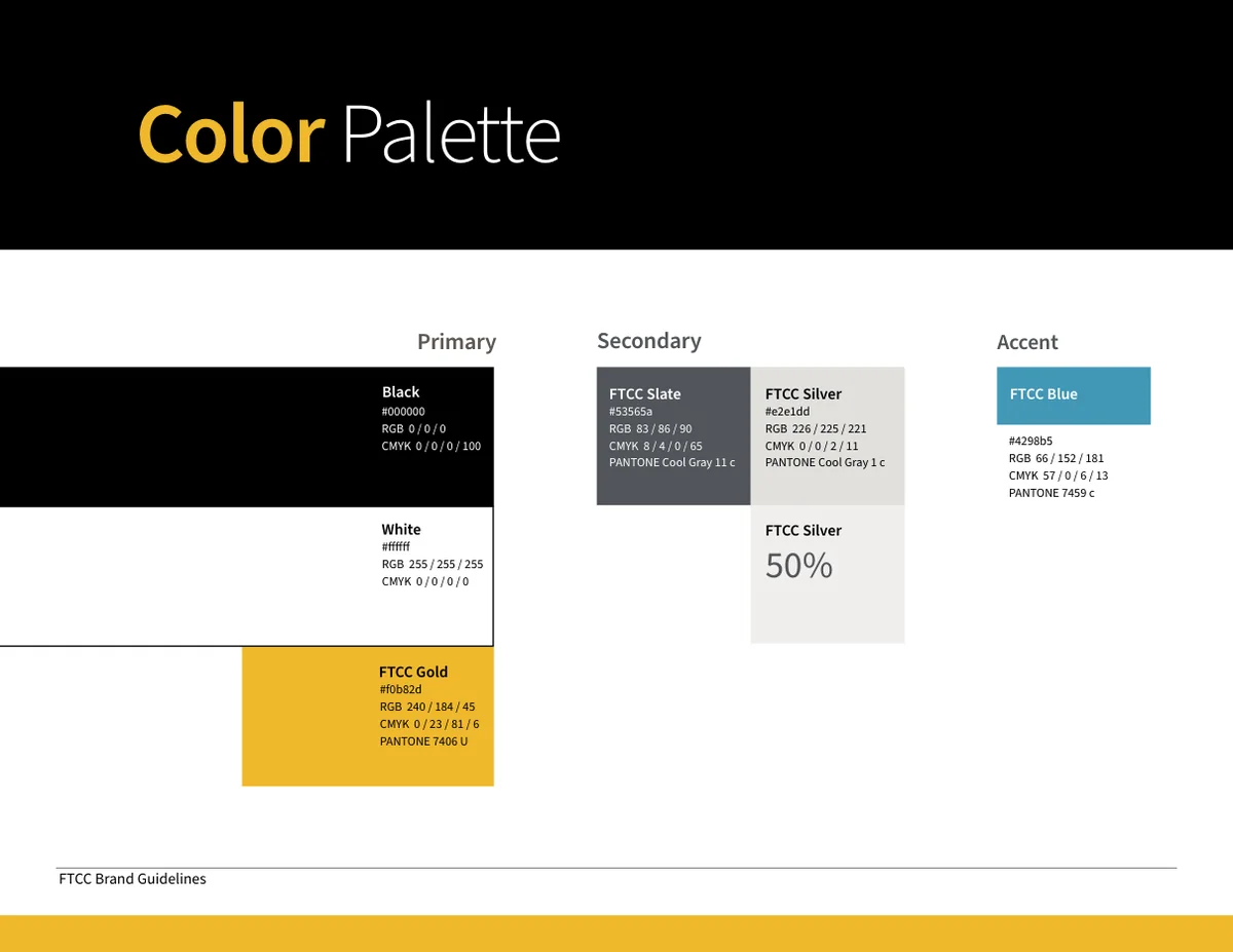
- Color. Black, white and gold as the base, Slate and Silver as cool neutrals, and Blue used sparingly as an accent.
- Typography. Source Sans 3 Bold for headlines and Source Serif 4 for labels: an open, sturdy pair that reads well at every size.
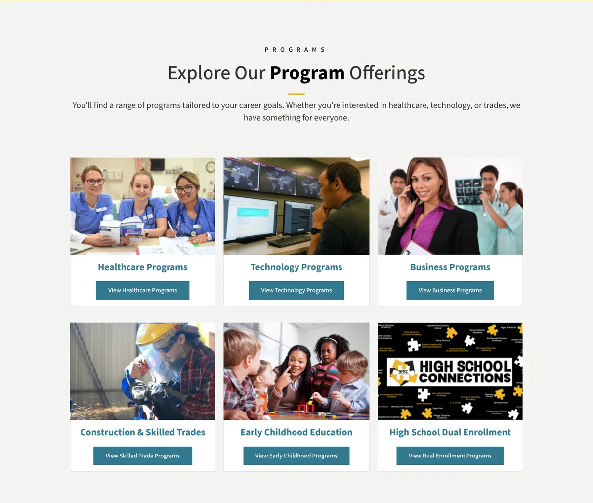
- Components. Cards for programs, events and news, each with a photo, a short title and one clear button; call-to-action buttons; accordions; and a quick-access bar that stays visible on phones.
- Photography. Real FTCC students and graduates instead of generic stock images.


Real students, real pride
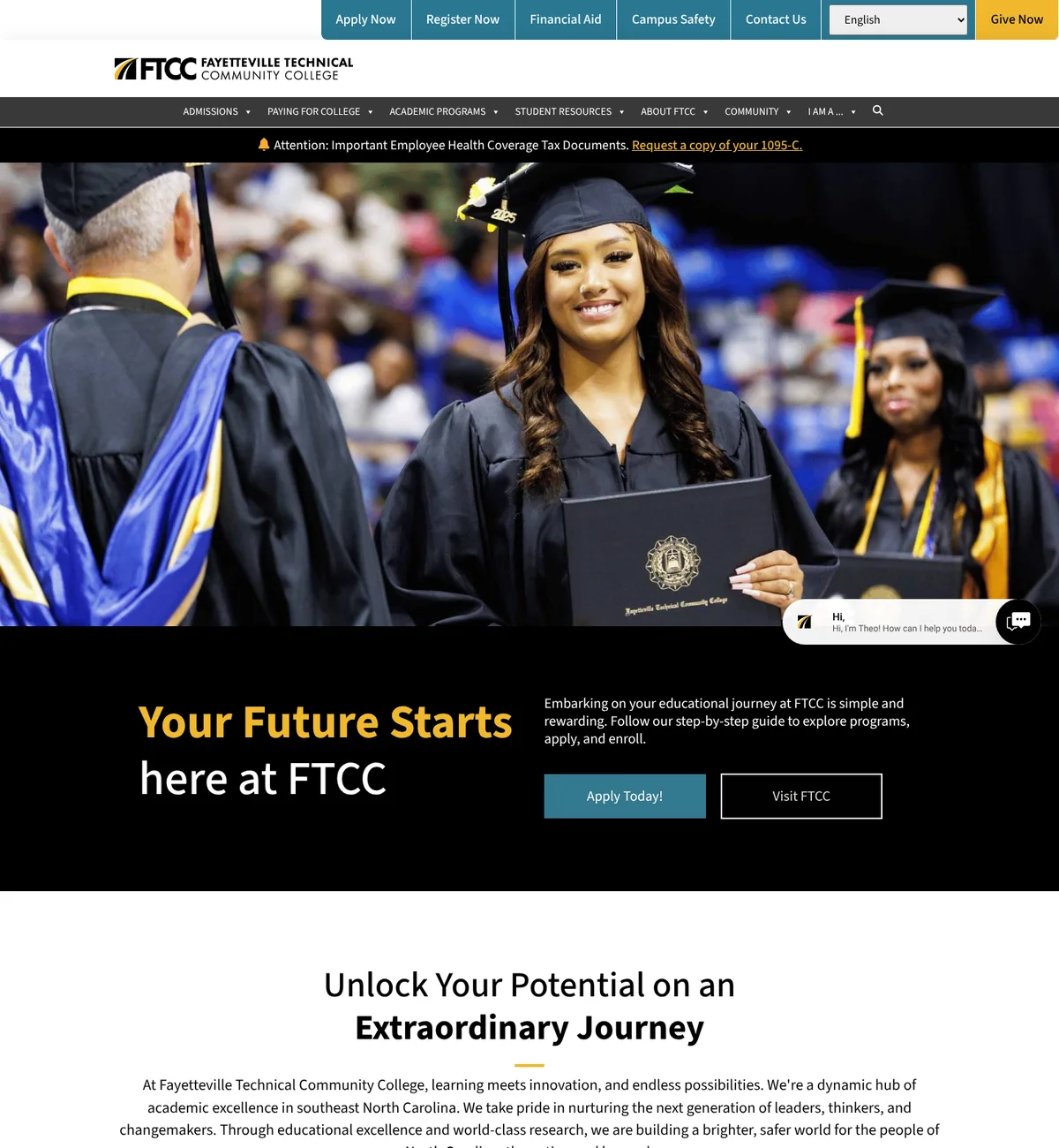
A college website is often the first place prospective students try to picture themselves. The design gives that moment to real people: FTCC’s own students and graduates, in black and gold.
The live homepage opens with a graduate in cap and gown, and every program card leads with a photo of people at work in that field.

Results
After launch, AndiSites reported (opens in a new tab) 16% more active users and 31% more average engagement time year over year, and more than 20,000 leads generated through the website in four months.
Accessibility decisions
- Black text on FTCC Gold: 11.6:1. White text on that gold would be 1.8:1, so gold never carries white text.
- FTCC Blue as an accent only: with white it reaches 3.3:1, enough just for large, bold text. FTCC’s own brand guidelines set the same rule: bold, 14 point or larger.
- Slate and silver as neutrals: white on slate is 7.4:1.
- Large buttons and cards that stack cleanly on phones.
From proposal to live site
The live site carries the visual direction of the proposal: black and gold, headlines in gold and white over black, program cards with real photography and FTCC’s own graduates at the front. The AndiSites team built the site and keeps its news and events up to date.
Recognition
MarCom Award, Gold, 2026, and w3 Award, Silver, 2026: Fayetteville Technical Community College, w3 Awards winners gallery (opens in a new tab). Awarded to AndiSites Inc. for the Fayetteville Technical Community College website. My role: UX/UI Designer.
My role in the team
Part of the AndiSites Inc. team, through eMirDesigner LLC: visual direction, color system, typography, UI components and homepage design.